Author: Josip Glaurdić | 26.02.2025
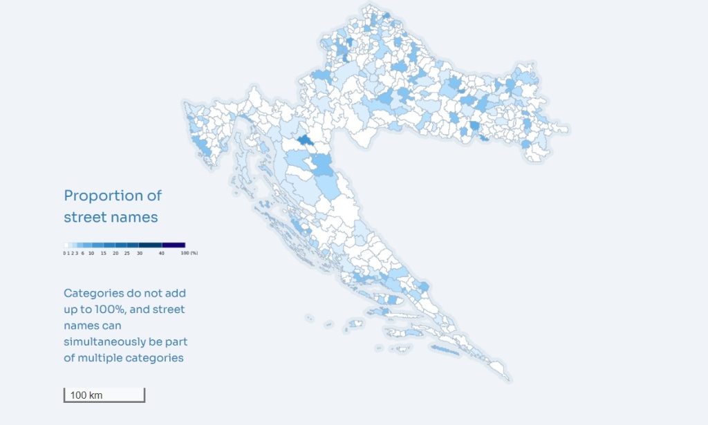
Picture: © Lexicon of Croatian Streets project (LexiCS). The map visualises the number of streets named after women in settlements.
I teach the course Democracy, Conflict, and Development in the Master of European Governance programme at the University of Luxembourg. As part of a concluding session, I have the students imagine they are the cabinet of ministers of a country that just came out of violent conflict. Their task is to create a list of challenges (and perhaps some opportunities) created by the end of violence for each of them. I also ask the students to fast-forward years or even decades into the – presumably peaceful – future to think about how those challenges evolve over time. Inevitably, their lists become long, and the students are left stunned by the monumentality of problems faced by post-conflict societies.
The point of the exercise is not to dishearten the newest generation of policymakers and analysts we train in our programme, but rather to help them synthesise in one place the lessons they have learned about the nature and consequences of conflict and the prospects for cooperation. The purpose is also to have the students think critically about the knowledge gaps we still have in peace and conflict research. Paradoxically, although those lists of challenges – grounded in the empirical findings we talk about in class – are long, our conclusion is always that there is so much more we do not know.
But how do we get a sense of what we do not know? Much has been achieved in peace and conflict research, and yet so much more still needs to be done to bridge the disciplinary boundaries that limit true progress, to improve the theoretical foundations and empirical evidence underlying our research, and to make that research socially recognisable and relevant. New digital humanities methods and new tools and approaches to the visualisation of data – particularly in geographic space and over time – can help us make those advancements. Here I reflect on five different aspects of integrating new approaches to visualisation into our research.
Comprehension: Expanding understanding and fostering analysis
New visualisation methods can expand comprehension within peace and conflict research by translating abstract data into accessible visual formats. Conflict dynamics often involve multifaceted variables – ranging from political instability and economic disparities to social grievances – that may overwhelm textual or numerical presentations. Through visual tools, researchers can distil these variables into discernible patterns and trends. For example, a map of geolocated conflict incidents can reveal hotspots and temporal escalations, allowing analysts to focus on specific areas or periods. One of the sources we digitised and presented on the Mapdat is the 1964 census of some 600,000 victims of
World War II violence in the former Yugoslavia. Each victim was geocoded by location, with the platform also showing data about their ethnicity, year of death and status. This section of Mapdat gives us an unparalleled view into the evolution and direction of violence across the former Yugoslavia and over the four years of World War II.
More importantly, visualisations can also enable researchers to identify correlations, anomalies, and causal pathways. In the process of creating the LexiCS platform, which shows the evolution of naming practices for more than 50,000 streets in Croatia, regional and politically determined patterns in the naming of streets quickly emerged, but only once the platform was completed. By providing intuitive access to underlying data structures, visualisation tools facilitated hypothesis generation and validation by our team of researchers. Most importantly, visualisations can improve the comprehension not only of experts but also of non-specialist audiences, which may lack the technical proficiency to engage with raw data.
Narrative: Integrating visualisations into storytelling
Narratives are central to understanding and communicating the human and systemic dimensions of conflict. Visualisations, when successfully integrated into narrative structures, can enhance storytelling by providing compelling evidence and context. This, of course, is easier said than done. Many visualisation efforts try to mask a lack of qualitative evidence with technological prowess, rather than building upon that qualitative evidence and improving the narrative. Successful integration of visualisations with qualitative narratives can help ensure a balance between empirical rigour and human-centric perspectives. My team faced this question when constructing LexiCS. We ultimately opted to create a whole section of the platform called ‘Stories’, where we tried to put the data visualisations to use in building narratives. We believe that this synergy makes the narratives more credible and ensures that storytelling is both impactful and data driven.
Complexity: Representing multidimensional data, ambiguity and aesthetics
When representing complex peace and conflict data, we need methods capable of accommodating multidimensionality. Techniques such as layered visualisations or interactive dashboards allow researchers to present multiple dimensions simultaneously. For instance, a layered map might include information on political boundaries, population density, and conflict intensity, thus providing a more complete view of intersecting factors. This is what we tried to achieve with the Mapdat platform, by letting users overlay different variables from different periods of time on the same map of municipalities in the former Yugoslavia. After much testing and experimentation, however, we ended up with a solution that satisfied hardly anyone – a testament to how difficult it is to strike a balance between clarity and visual appeal. We also struggled to represent the ambiguity and uncertainty inherent in conflict data. Visually encoding uncertainty is extraordinarily difficult, partly because measuring that uncertainty is often more art than science.
Interactivity: Enhancing accessibility and inclusivity
Interactivity can transform static data visualisations into dynamic tools for exploration and analysis. By allowing users to manipulate variables, filter datasets, or zoom into specific details, it empowers researchers and stakeholders to tailor the visualisation to their unique inquiries. Mapdat gives users quite a bit of power to interact with the data, by choosing different variables, timelines, and the aforementioned overlays. However, in our experience these interactivity measures need to be implemented thoughtfully in order to avoid overwhelming users with excessive options or complex interfaces. Accessibility and inclusivity are key considerations here. Ensuring that visualisations are usable across diverse devices and for individuals with varying levels of digital literacy is also essential. At the same time, interactivity carries potential risks. Poorly designed tools may introduce confusion or misinterpretation, particularly when users lack guidance on how to engage with the data. To mitigate this, interactive visualisations should include clear instructions and, where feasible, explanations of the data and its limitations.
Ethics: Navigating bias and ethical responsibilities
Ethical considerations are paramount in data visualisation, particularly in the sensitive domain of peace and conflict research. Visualisations have the power to shape narratives and influence decision-making, raising questions about representation and bias. Choices regarding what data to include, how to frame trends, or which variables to emphasise can inadvertently perpetuate biases or obscure critical dimensions of a conflict. Transparency has to be the guiding ethical principle. Visualisations should clearly document their data sources, methods, and limitations to ensure that audiences understand the context and constraints of the presented information. Furthermore, researchers must strike an ethical balance between simplification for clarity and fidelity to the data’s complexity. Privacy is another critical consideration, particularly when visualisations include sensitive data. Anonymizing data or aggregating it to higher levels can protect individuals’ identities without compromising the visualisation’s utility. Finally, aesthetics and design decisions have ethical implications. The use of sensationalised or overly dramatic visuals can distort interpretations and fuel polarising narratives. Responsible visualisations will prioritise accuracy, clarity, and respect for the subjects represented.
Conclusion
Visualisations can be valuable tools in peace and conflict research. When designed with interactivity, accessibility, and ethical considerations in mind, they can become not just instruments of analysis but also guides to informed action and inclusive engagement. By addressing challenges like ambiguity, bias, and usability, researchers can harness the power of visualisation to advance understanding and promote constructive solutions in conflict contexts. However, we should understand firstly that visualisation methods are not silver bullets that will overcome weaknesses inherent in poor research design or execution. And secondly, harnessing the power of visualisation methods requires expertise, thoughtfulness, and ultimately time that researchers often do not have. This is why such efforts can best be supported by teams of interdisciplinary peace and conflict scholars who – crucially – need to be assisted by skilled designers, cartographers, and data scientists.
Author
 Josip Glaurdić is a Full Professor of Political Science at the University of Luxembourg, specialising in comparative politics, international relations, and political economy.
His research focuses on the legacies of conflict in electoral outcomes and governance, with a particular emphasis on Southeast Europe. He and his team explore the interaction between war legacies and peacetime policies in post-conflict societies through a combination of historical analysis and advanced methodological tools, such as machine learning and public opinion research. In the period from 2017 to 2022, Prof. Glaurdić was the PI of the ERC-funded project ELWar (Electoral Legacies of War: Political Competition in Postwar Southeast Europe). He is a member of KonKoop’s Academic Advisory Board.
Citation: Glaurdić, Josip, “… there is so much more we do not know” – Data Visualisation in Peace and Conflict Research, KonKoop DataLab Blog, published online: 26/02/2025, https://konkoop.de/index.php/blog/datalab-blog-there-is-so-much-more-we-do-not-know-data-visualisation-in-peace-and-conflict-research/